CSS小技巧
单行显示省略号
white-space: nowrap;    /* 文本一行显示 */
overflow: hidden;   /* 隐藏超出的文本 */
text-overflow: ellipsis;    /* 超出的用省略号 */
多行显示省略号
display: -webkit-box;
-webkit-box-orient: vertical;
box-orient: vertical;
-webkit-line-clamp: 2; /* 限制显示两行 */
line-clamp: 2; /* 限制显示两行 */
overflow: hidden;   /* 隐藏超出的文本 */
text-overflow: ellipsis;    /* 超出的用省略号 */
去除表格中间隙和两层边框
当我们给td设置 border的时候,两个单元格之间会出现间隙和两层边框
给table加上边框折叠属性:border-collapse:collapse;
用CSS画一个三角形
使用border
<style>
    .box{
        width: 100px;
        height: 100px;
        border: 100px solid red;
        box-sizing: border-box;
        border-top-color: transparent;
        border-left-color: transparent;
        border-right-color: transparent;
    }
</style>


<div class="box"></div>
随着浏览器窗口变化,图片中间部分一直在浏览器中间显示
方法一:使用background-position
<style>
    .box{
       background-image:url(...);
       background-position:center;
    }
</style>


<div class="box"></div>
方法二:使用relative
<style>
    .box{
        height: 400px;
        background-color: red;
        overflow: hidden;
    }

    .box img{
        position:relative;
        /*left: px ;  这个大小需要我们计算一下,值为你的图片长度的一半,下面是优化 */
        transfrom:translate(-50%,0);
        margin-left: 50%;
    }
</style>


<div class="box">
    <img src="..." alt="">
</div>
去除多个行内级元素中间的空格
造成这样的原因是因为我们在写代码的时候,换行符被浏览器解析了
/* 换行符造成了行内级元素之间有间隙 */
<div>
    <span>1</span>
    <span>2</span>
    <span>3</span>
</div>
- 删除换行符(不推荐)
- 将父级元素的font-size设置为0,但是需要子元素设置回来(不推荐)
- 通过子元素(span)统一向一个方向浮动即可
- flex布局
中间居中布局
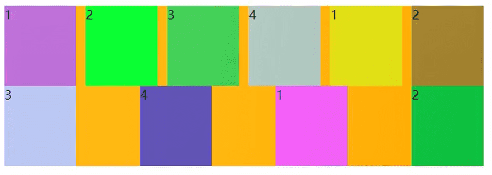
1、效果图
2、当我们设置为这样的时候:
<style>
    body,div{
        margin: 0;
        padding: 0;
        box-sizing: border-box;
    }
    .box{
        width: 1190px;
        height: 500px;
        background-color: aqua;
        margin: 0 auto;
        color:white;
    }
    .item{
        width: 230px;
        height: 322px;
        background-color: blue;
        float: left;
        margin-right: 10px;
    }
</style>

<body>
    <div class="box">
        <div class="item">1</div>
        <div class="item">2</div>
        <div class="item">3</div>
        <div class="item">4</div>
        <div class="item">5</div>
    </div>
</body>
3、变成这样:
4、第五个区域会因为不够宽而跑出去,因为我们设置了box宽度为1190px;盒子宽度230px;margin-right:10px;总宽度 230×5+10×5 = 1200 > 1190
5、解决办法【不能直接将 .box的宽度设置为1200px,如果直接设置,其实我们的区域向左偏了这个 margin-left:10px;】
在 .item 外面重新套一个div,把这个div的宽度变成 1200px
<style>
    body,div{
        margin: 0;
        padding: 0;
        box-sizing: border-box;
    }
    .box{
        width: 1190px;
        height: 500px;
        background-color: aqua;
        margin: 10px auto;
        color: white;
    }
    .contain{
        margin-right: -10px;
    }
    .item{
        width: 230px;
        height: 322px;
        background-color: blue;
        float: left;
        margin-right: 10px;
    }
</style>

<body>
    <div class="box">
        <div class="contain">
            <div class="item">1</div>
            <div class="item">2</div>
            <div class="item">3</div>
            <div class="item">4</div>
            <div class="item">5</div>
        </div>
    </div>
</body>
6、为什么里面的div宽度会变成 1200px呢?
原理:定位参照对象的宽度= left + right + margin-left + margin-right + 绝对定位元素的实际占用宽度
父级盒子宽度(.box)= 子盒子(.contain) + left + right + margin-left + margin-right
1190px = x + 0 + 0 + 0 + (-10px) ——> 所有x被迫为1200px,子盒子宽度为1200px
解决如下布局问题
问题

<style>
    .container{
        width: 500px;
        background-color: orange;
        display: flex;
        flex-wrap: wrap;
        justify-content: space-between;
    }

    .item{
        width: 110px;
        height: 100px;
        border: 1px solid black;
        box-sizing: content-box;
    }
</style>

<body>
    <div class="container">
        <div class="item item1">1</div>
        <div class="item item2">2</div>
        <div class="item item3">3</div>
        <div class="item item4">4</div>
        <div class="item item5">5</div>
        <div class="item item6">6</div>
    </div>
</body>
解决办法
加入span元素(或者i也行)去填充空缺的位置

<style>
    .container{
        width: 500px;
        background-color: orange;
        display: flex;
        flex-wrap: wrap;
        justify-content: space-between;
    }

    .item{
        width: 110px;
        height: 100px;
        border: 1px solid black;
        box-sizing: content-box;
    }

     span{
        /* 设置的宽度就是items的宽度,用span来填充空的位置,因为span没有设置高度,所以不会有影响 */
         width: 110px;
     }
</style>

<body>
    <div class="container">
        <div class="item item1">1</div>
        <div class="item item2">2</div>
        <div class="item item3">3</div>
        <div class="item item4">4</div>
        <div class="item item5">5</div>
        <div class="item item6">6</div>
        /* 添加span个数为 列数-2 */
         <span></span>
         <span></span>
    </div>
</body>
蒙版
 <div className="coverAll"></div>


.coverAll{
    // 记得给父元素这是 position:relative;
    position: absolute;
    left:0;
    right: 0;
    top: 0;
    bottom: 0;
    background-color:rgba(255,255,255,.8)
}
毛玻璃

<div class="box">
  <div class="frosted__glass">毛玻璃</div>
</div>
.box {
  width: 700px;
  height: 700px;
  display: flex;
  justify-content: center;
  align-items: center;
  background: url('http://k21vin.gitee.io/front-end-data-visualization/assets/bg01.13dfb262.jpg');
  background-size: 100%;
  background-position: center;
}

.frosted__glass {
  width: 80%;
  height: 40%;
  border-radius: 40px;
  display: flex;
  justify-content: center;
  align-items: center;
  font-size: 60px;
  letter-spacing: 0.5em;
  backdrop-filter: blur(20px);
  color: #fff;
  box-shadow: 0 0 30px 10px rgba(0, 0, 0, .3);
}
在 CSS 中,想要实现模糊效果,可以使用 滤镜 。背景通常设置成黑色、灰色或者白色,然后再设置一下背景的不透明度就能实现一个简单的毛玻璃效果。
上面的代码中,backdrop-filter: blur(20px); 是重点。有了它就实现了毛玻璃的基本效果。
最后加上 box-shadow: 0 0 30px 10px rgba(0, 0, 0, .3); 让毛玻璃与背景之间产生一点阴影,看起来会更自然
使用视频作为背景
<div class="video-box">
   <video class="video-background" preload="auto" loop playsinline autoplay src="链接" tabindex="-1" muted="muted"></video>
</div>
* {
    margin: 0;
    padding: 0;
}

.video-box {
    position: relative;
    height: 100vh;
    background-color: #C1CFF7;
    /*进行视频裁剪*/
    overflow: hidden;
}

.video-box .video-background {
    position: absolute;
    left: 50%;
    top: 50%;
    /*保证视频内容始终居中*/
    transform: translate(-50%, -50%);
    width: 100%;
    height: 100%;
    /*保证视频充满屏幕*/
    object-fit: cover;
    min-height: 800px;
}
通过CSS实现文本内容过长,中间显示省略号...,两端正常展示
<ul class="con">
    <li class="wrap">
        <span class="txt">CSS 实现优惠券的技巧 - 2021-03-26</span>
        <span class="title" title="CSS 实现优惠券的技巧 - 2021-03-26">CSS 实现优惠券的技巧 - 2021-03-26</span>
    </li>
    <li class="wrap">
        <span class="txt">CSS 测试标题,这是一个稍微有点长的标题,超出一行以后才会有title提示,标题是 实现优惠券的技巧 - 2021-03-26</span>
        <span class="title" title="CSS 测试标题,这是一个稍微有点长的标题,超出一行以后才会有title提示,标题是 实现优惠券的技巧 - 2021-03-26">CSS
            测试标题,这是一个稍微有点长的标题,超出一行以后才会有title提示,标题是 实现优惠券的技巧 - 2021-03-26</span>
    </li>
    <li class="wrap">
        <span class="txt">CSS 拖拽?</span>
        <span class="title" title="CSS 拖拽?">CSS 拖拽?</span>
    </li>
    <li class="wrap">
        <span class="txt">CSS 文本超出自动显示title</span>
        <span class="title" title="CSS 文本超出自动显示title">CSS 文本超出自动显示title</span>
    </li>
</ul>
.con {
    font-size: 14px;
    color: #666;
    width: 600px;
    margin: 50px auto;
    border-radius: 8px;
    padding: 15px;
    overflow: hidden;
    resize: horizontal;
    box-shadow: 20px 20px 60px #bebebe,
        -20px -20px 60px #ffffff;
}

.wrap {
    position: relative;
    line-height: 2;
    height: 2em;
    padding: 0 10px;
    overflow: hidden;
    background: #fff;
    margin: 5px 0;
}

.wrap:nth-child(odd) {
    background: #f5f5f5;
}

.title {
    display: block;
    position: relative;
    background: inherit;
    text-align: justify;
    height: 2em;
    overflow: hidden;
    top: -4em;
}

.txt {
    display: block;
    max-height: 4em;
}
.title::before{
    content: attr(title);
    width: 50%;
    float: right;
    white-space: nowrap;
    overflow: hidden;
    text-overflow: ellipsis;
    direction: rtl;
}